The Richard Sachs Brew

2026

For my senior capstone project at Parsons School of Design we partnered with Richard Sachs for a brand extension into an e-commerce space and connect with a larger audience.
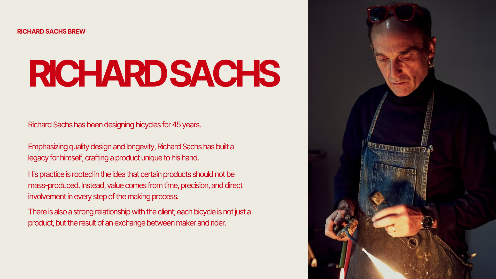
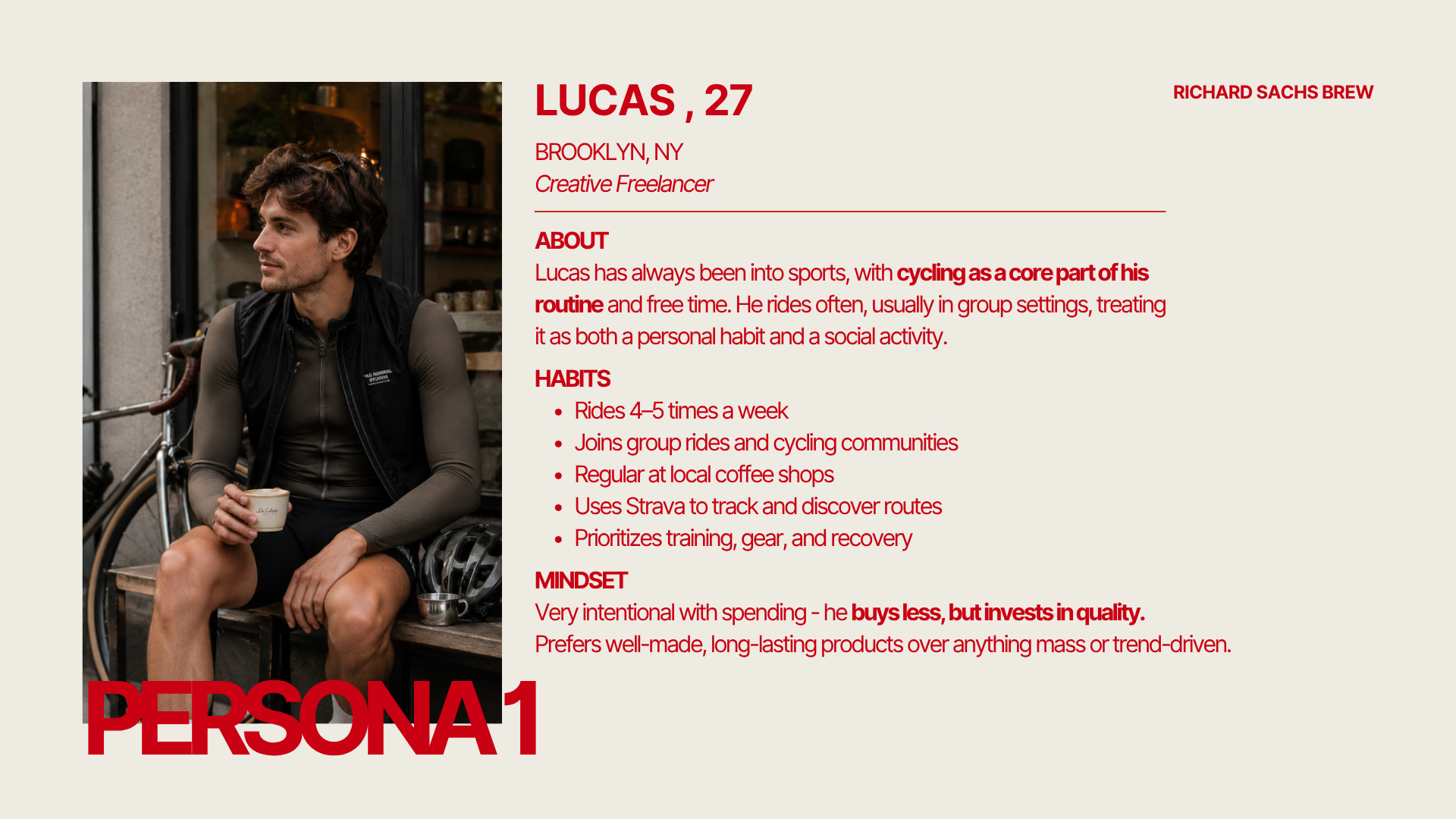
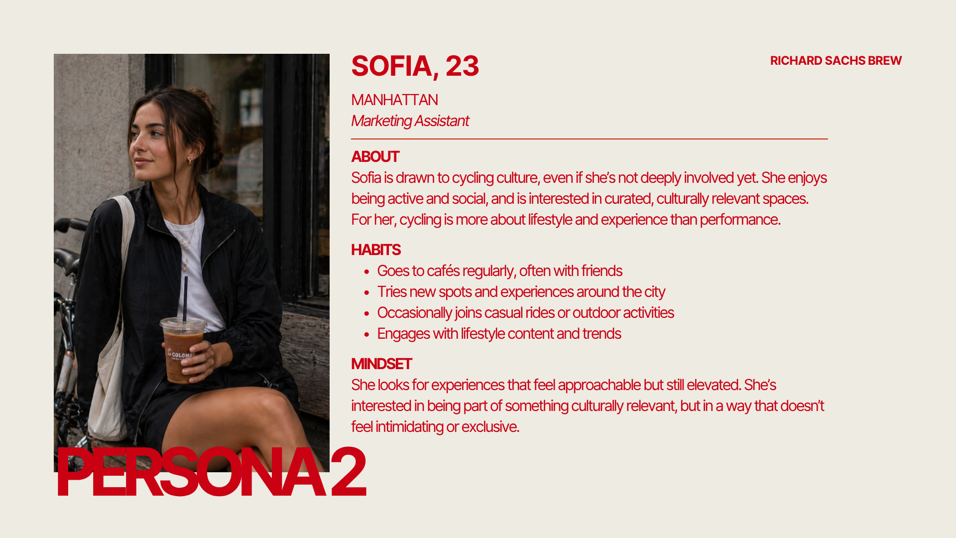
Richard Sachs is a luxury bicycle builder based out of Connecticut. World renowned for his work but at a very high price point. Our goal was to find a way to connect with his audience members who can’t afford one of his bicycles.
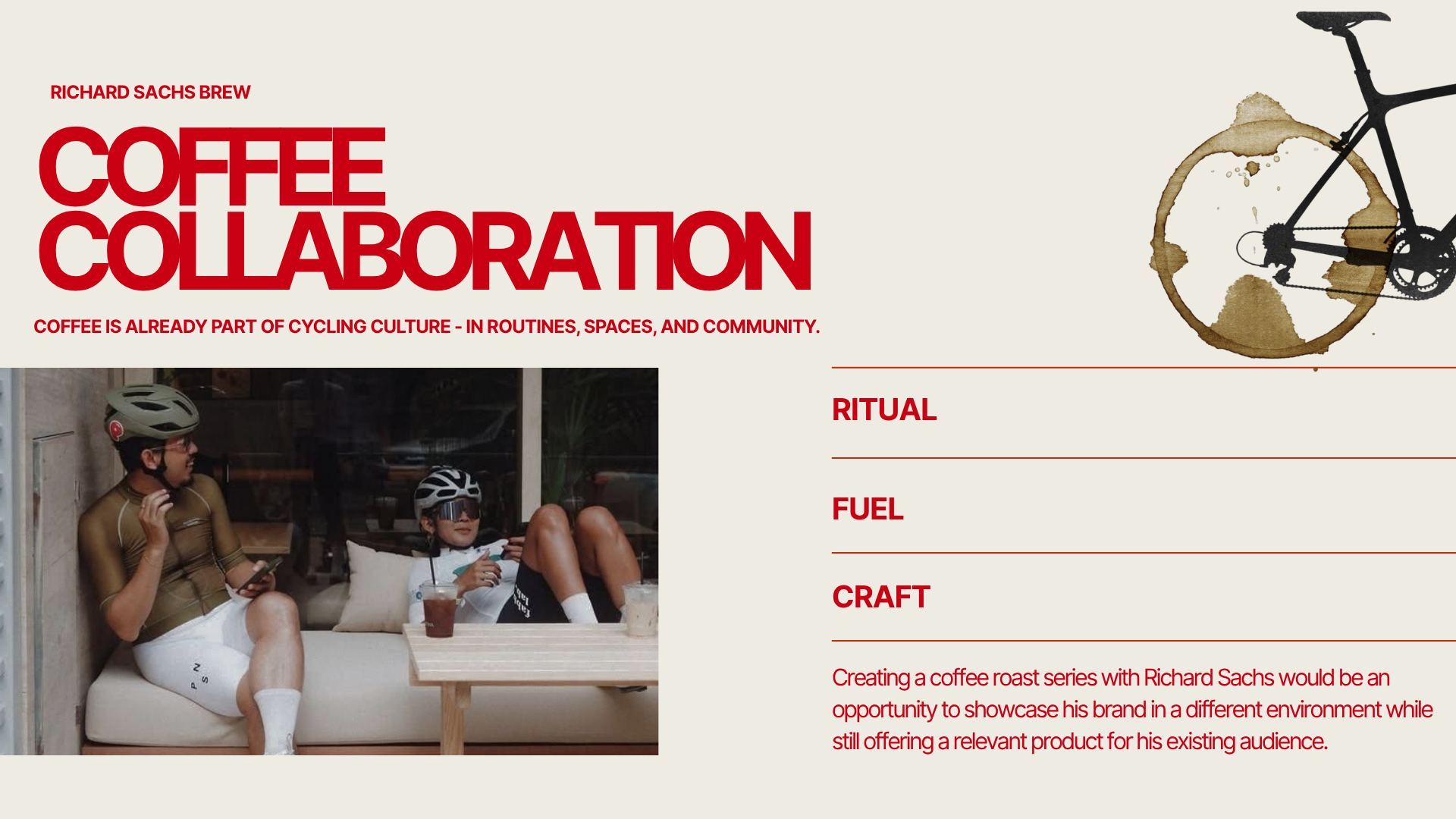
My team took this opportunity to explore what coffee and cycling look like in collaboration with Richards name and reach a larger audience.
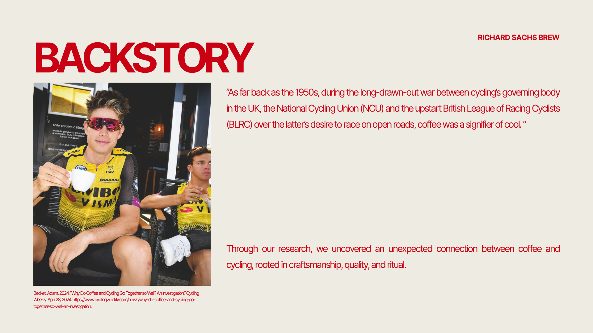
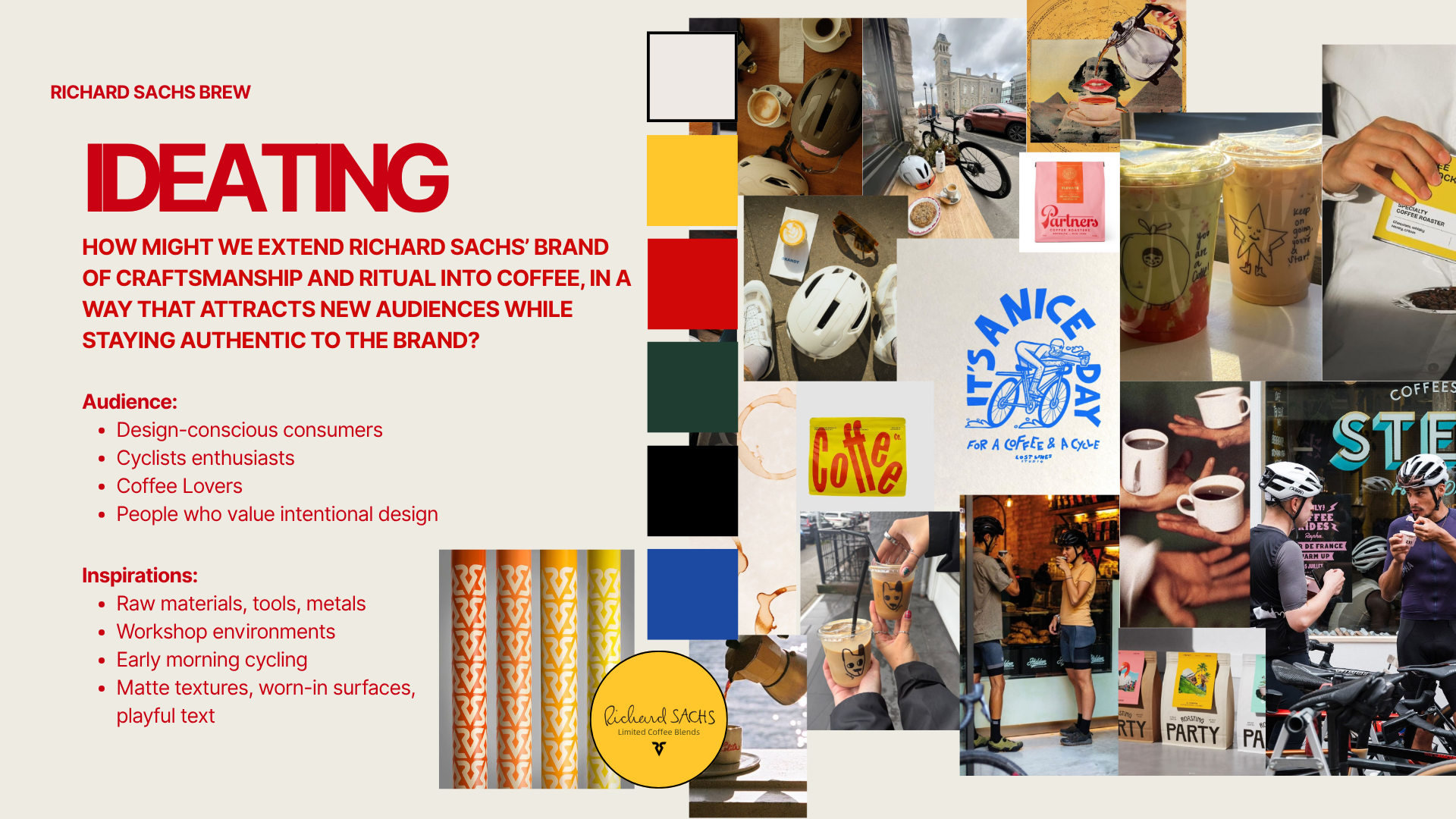
We began by researching the historical connection between cycling and coffee and how we could bring this type brand extension to life while still maintaining Richard’s core values within strategy planning and production planning.
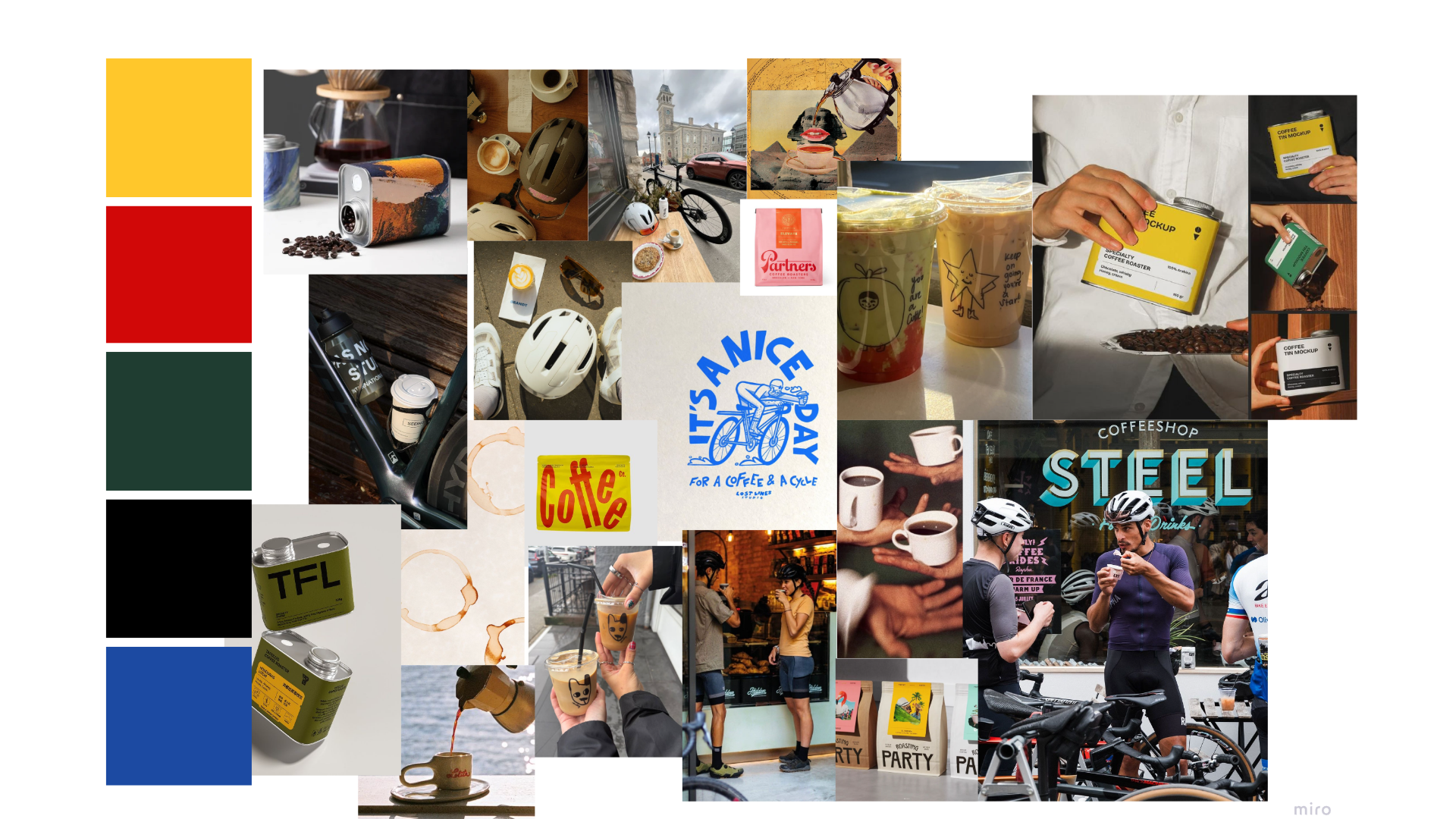
During our ideating phase, we began collecting imagery online that was specifically coffee, specially cycling and a blend of the two. With those images, we created a mood board with Richard Sachs signature colors.
Ideating
A common theme across our mood board was materiality of the packaging design. We wanted to emphasize utility in a reflective way of Richard’s bicycle design.
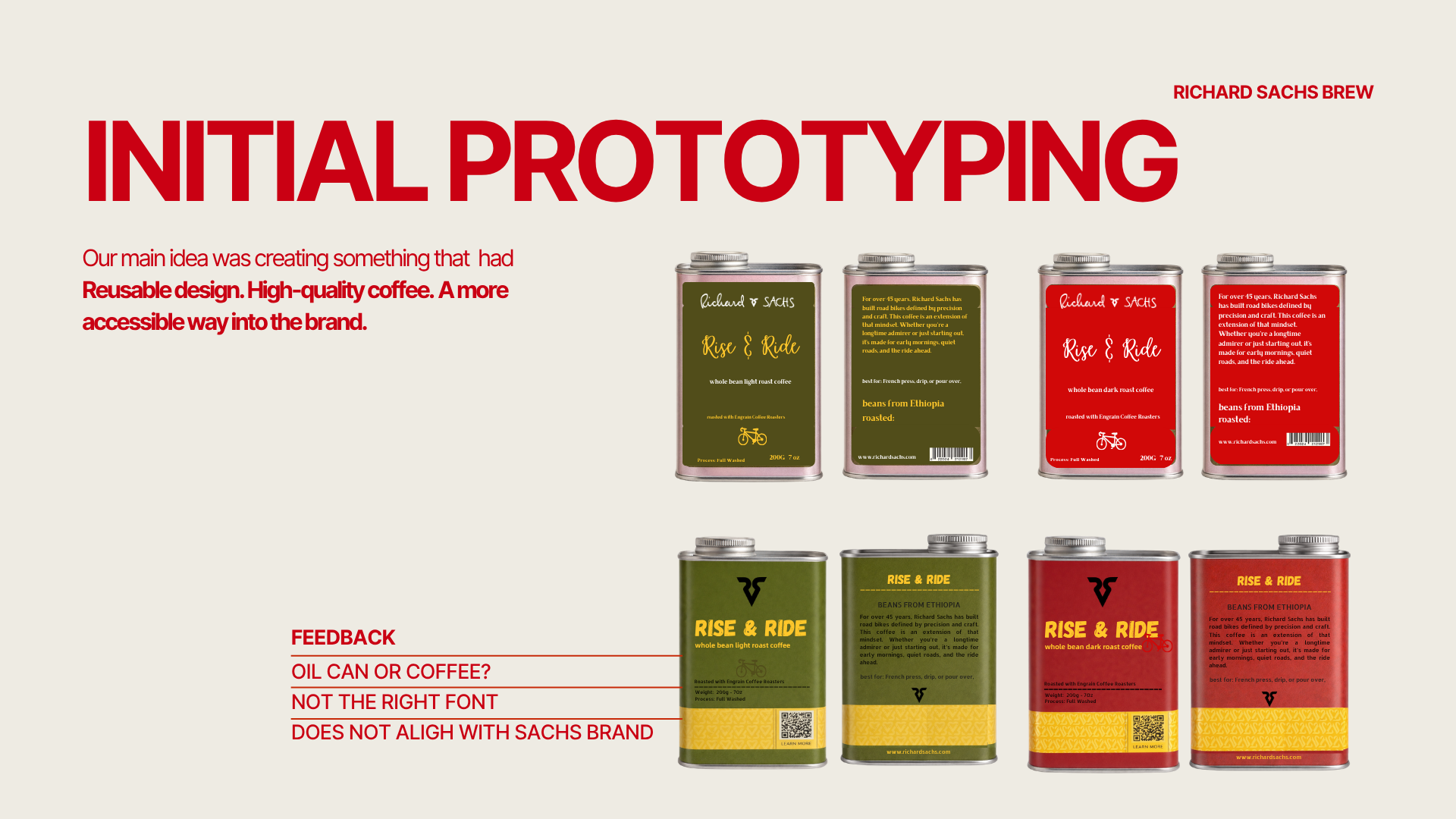
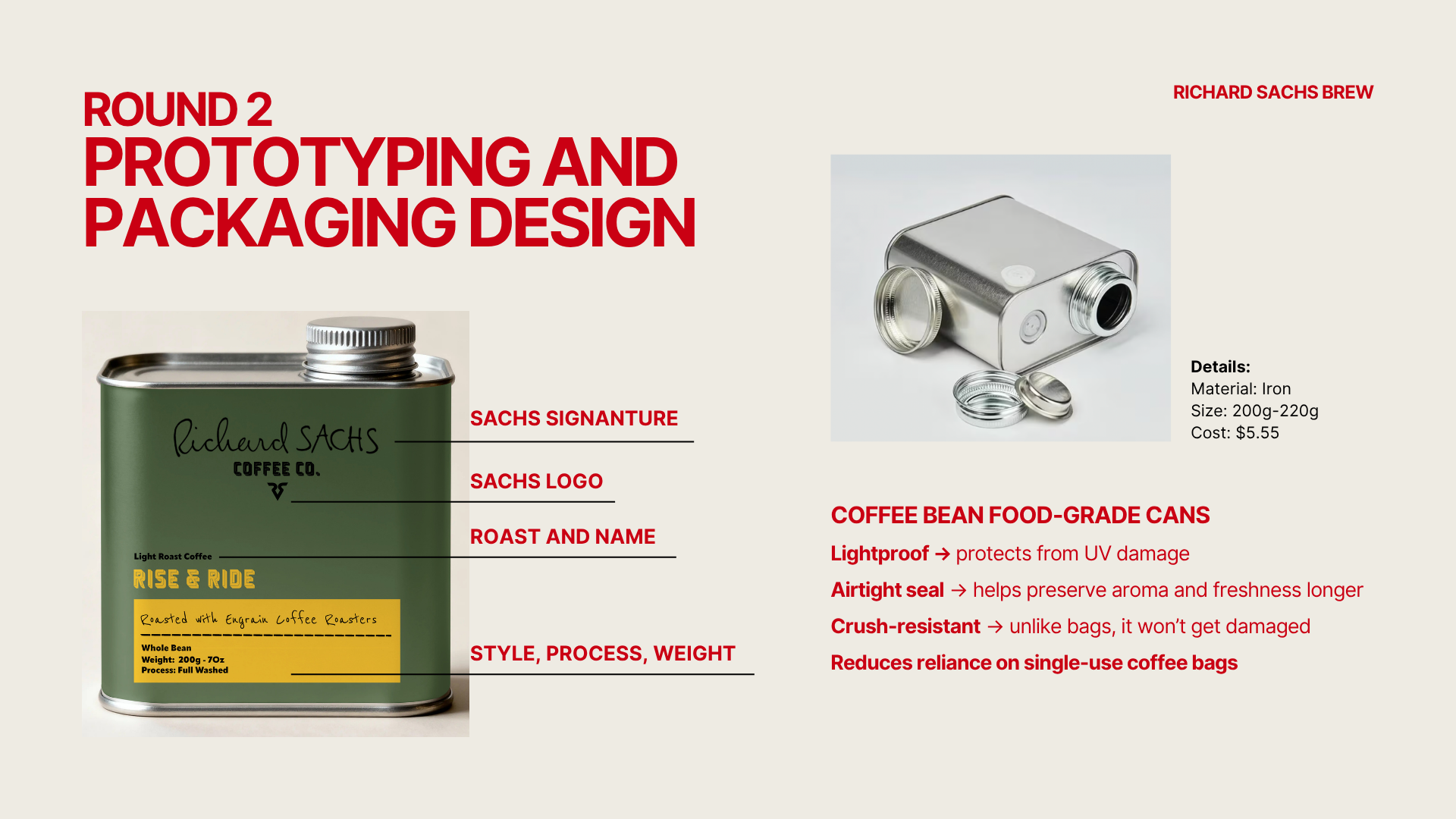
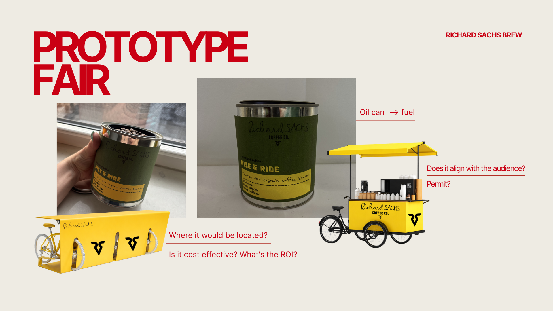
Into the prototyping stage, we attempted to create a tin can to hold the coffee beans that would be as close as possible to our desired design of a fuel can.
Prototyping
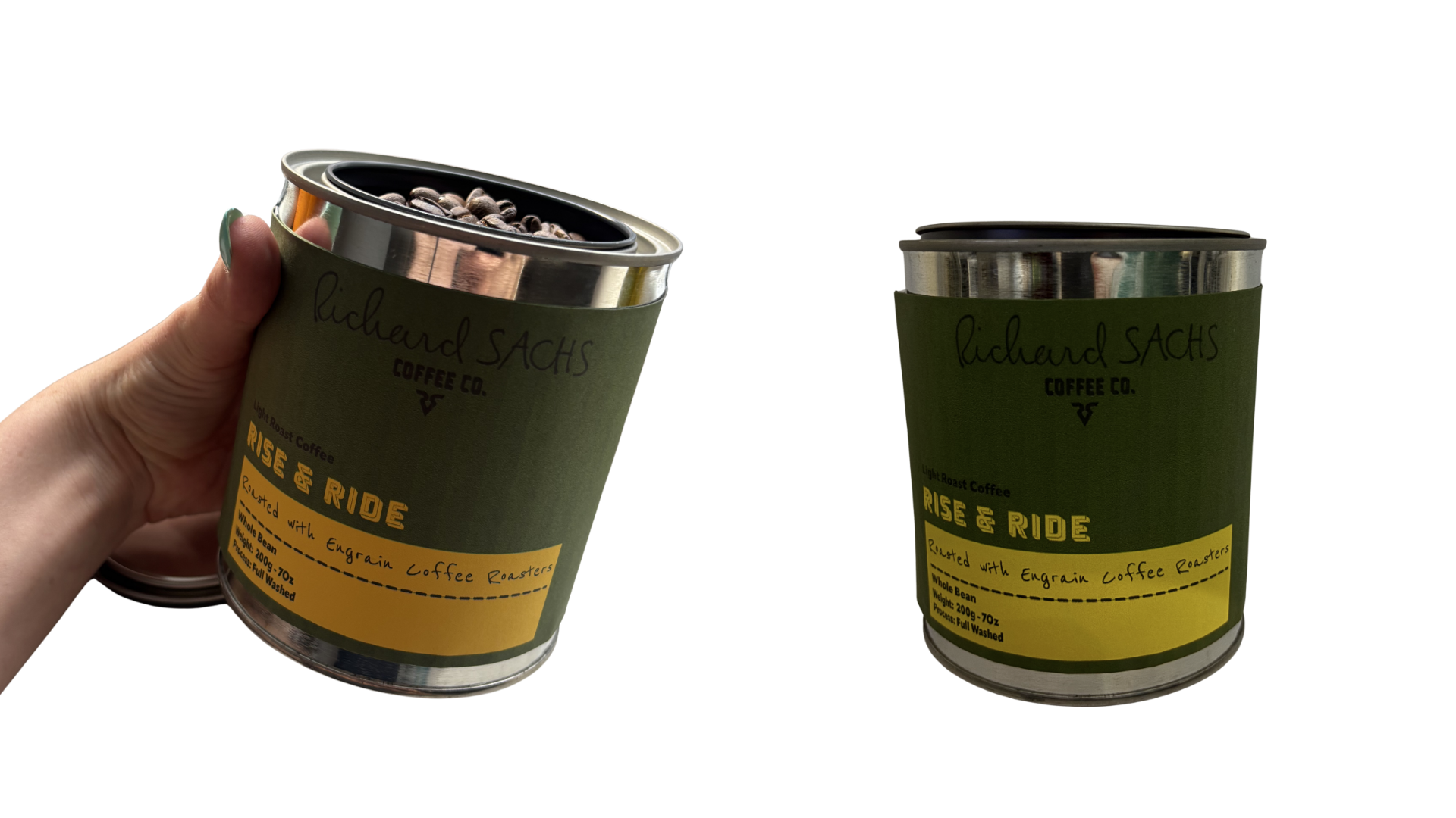
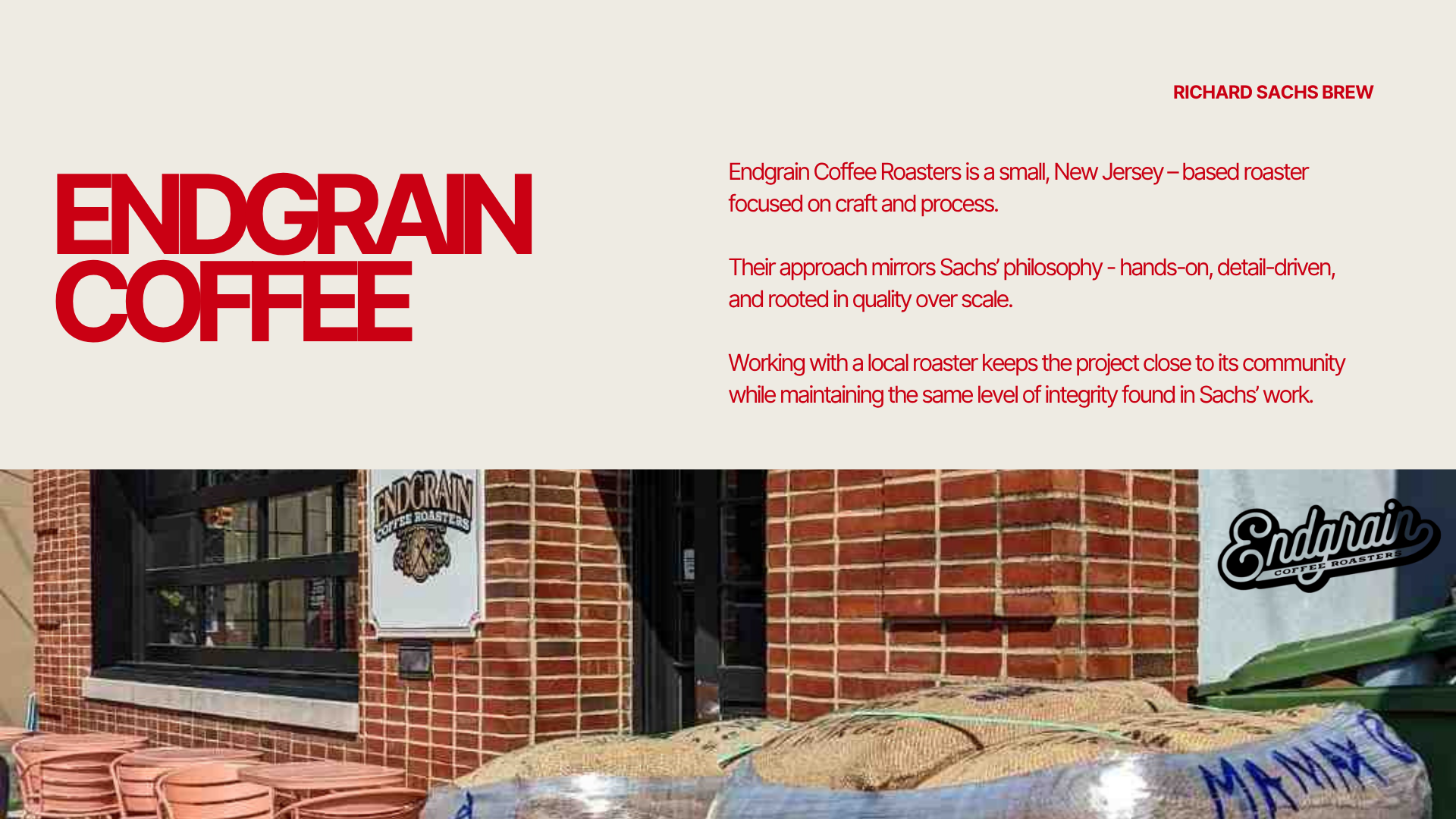
We used a paint can in this first prototype and filled it with the coffee beans from the coffee roaster we would collaborate with.
Based off feedback at a prototype fair, we determined that the shape of the can was crucial to emulate that “fuel” feel we wanted to achieve to draw viewers in.
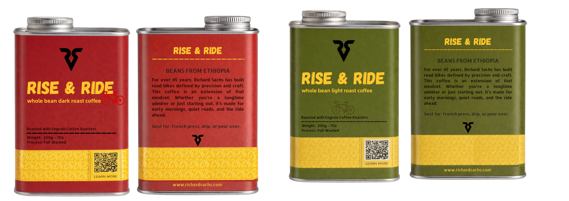
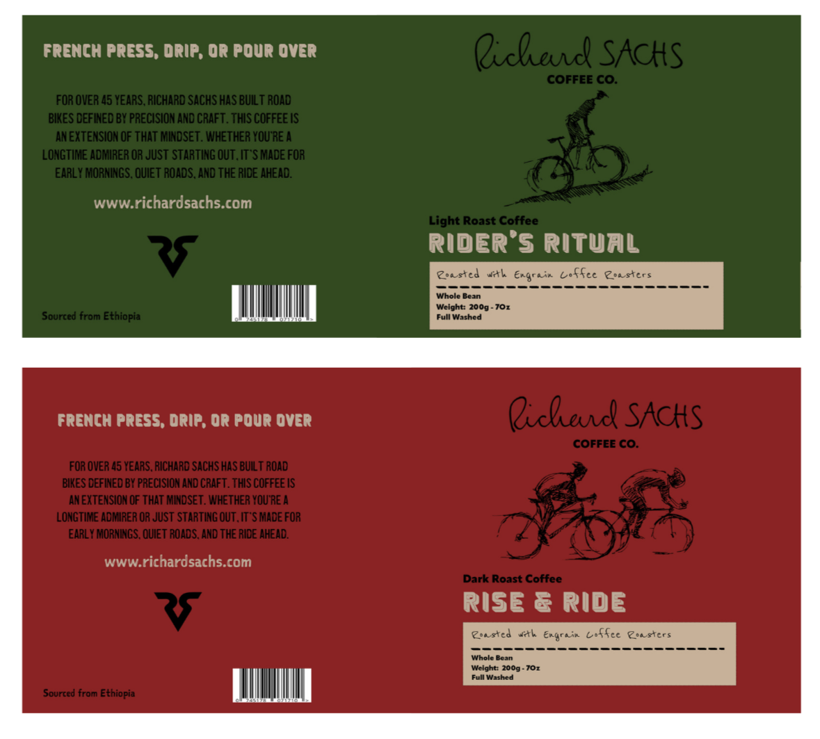
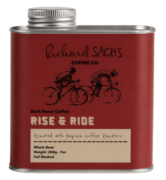
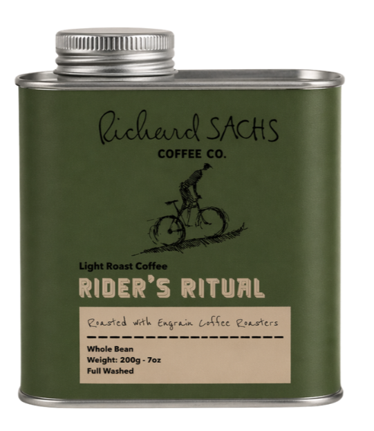
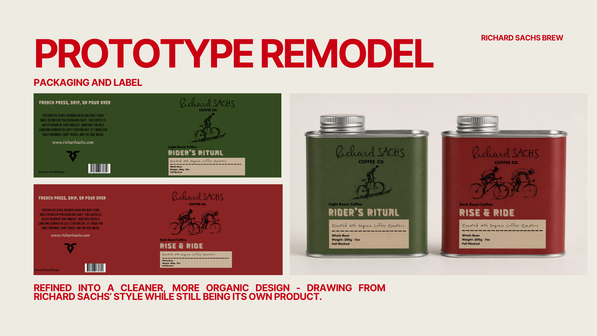
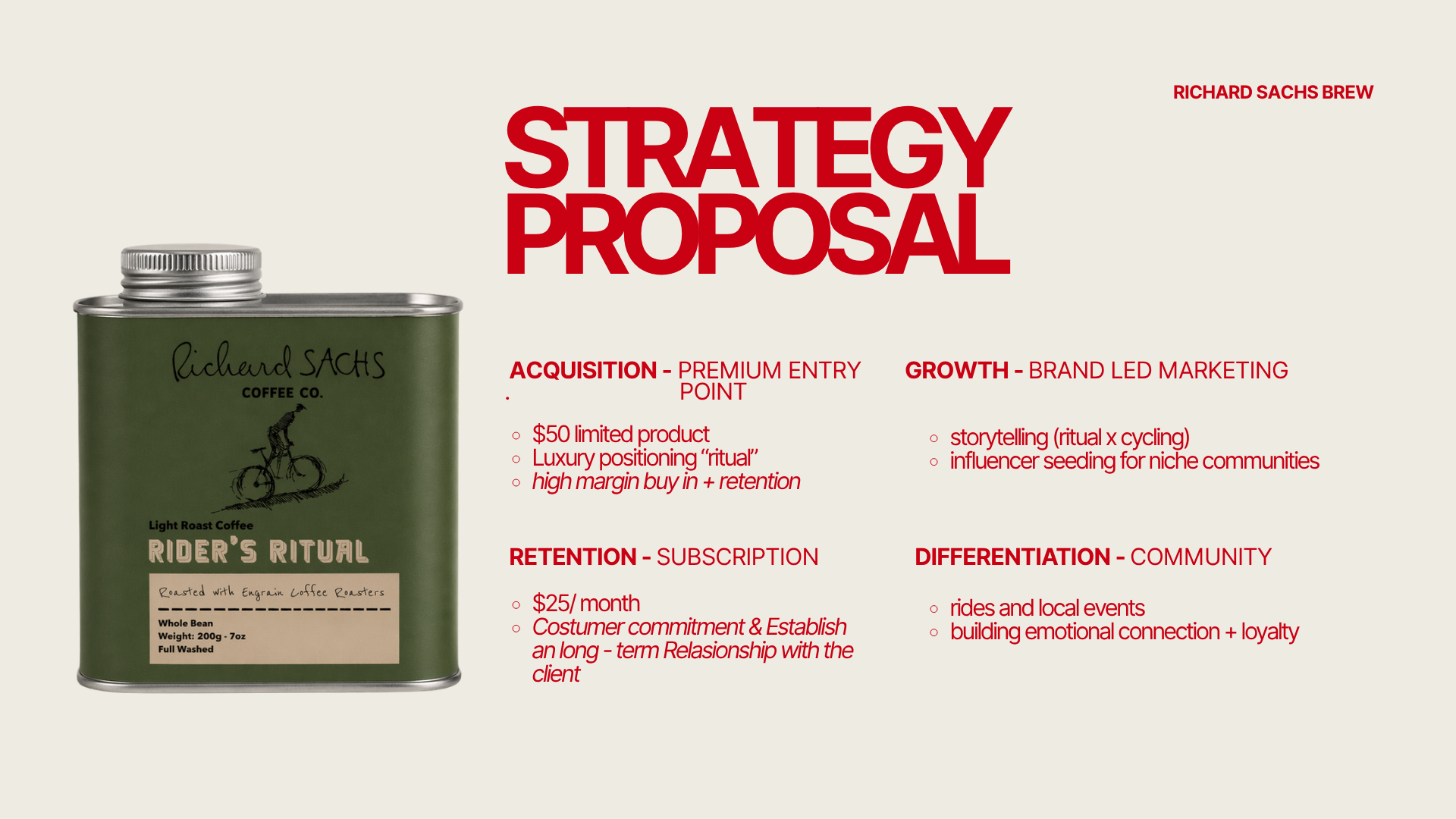
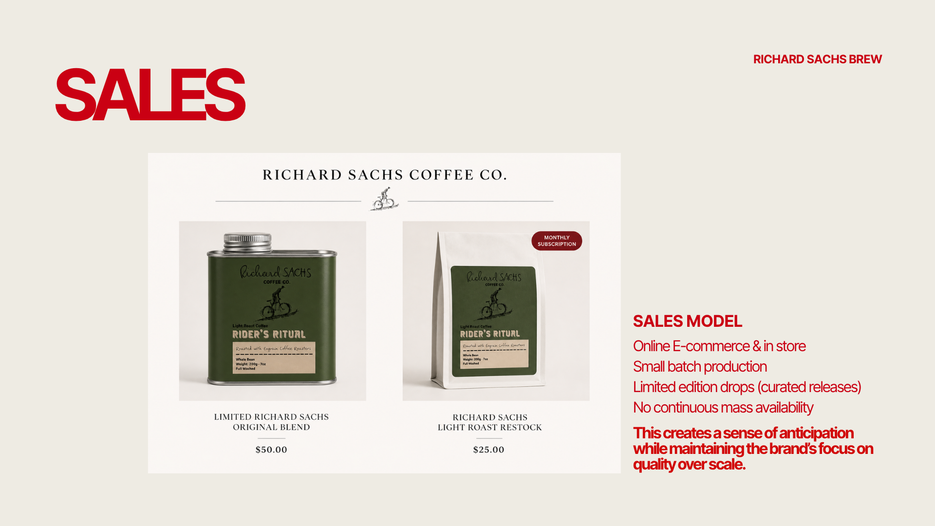
Final Concept
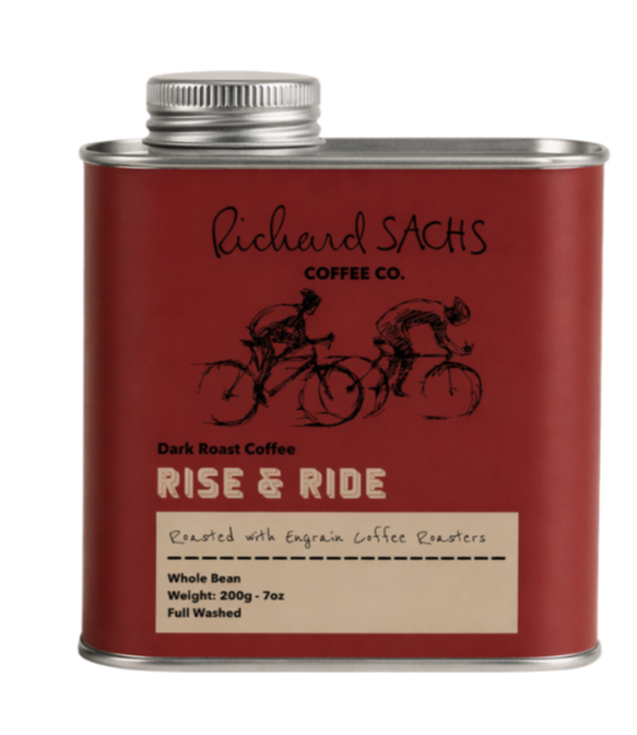
The final product design is meant to be simple and introduce a new niche within coffee. The packaging design gives a brief description of the roasts and Richard Sachs story.
The final product uses the Richard Sachs signature as well as a cycling sketch that is simple while still connecting with new audiences whether in store or in person.
partners

MARIA BEATRIZ RODRIGUES is a Strategic Design and Management graduate from Parsons, originally from Brazil. Passionate about luxury branding, PR, and sustainability, her work explores design, business, and consumer behavior.

MABEL GREEN is a highly motivated and passionate about Product and Branding Design, and Styling, She has hands-on experience in product design, fashion marketing, PR, styling, and film wardrobe she combines creativity and strategy.